Introduction
In this tutorial, you will learn to build a small app to toss a coin using HTML, CSS, and Javascript. The possible outcomes after flipping a coin are either “Head” or “tail”. The probability of getting head or tail is 50%.
To build this small project, you will
- Add images of both sides of the coin to the static assets
- Make the coin-tossing effect animation in CSS
- Trigger coin toss in Javascript
Demo
Step 1 — Initializing The Project
Your project folder includes the HTML, CSS, Javascript, and images:
.
├── index.html
└── src
    ├── css
    │   └── app.css
    ├── img
    │   ├── cent-head.png
    │   └── cent-tail.png
    └── js
        └── app.js
Add a new file in the root and call it index.html. Create the /src directory in the root and inside of /src, create /src/css, /src/js, and /src/img directories
Add app.css inside the /src/css and app.js under the /src/js directory.
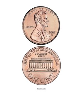
Find the image for both sides of the coin and add them to the /src/img directory.
The project setup is complete. Now, open the index.html file in your editor and add this code.
<!DOCTYPE html>
<html lang="en">
  <head>
    <meta charset="UTF-8" />
    <meta http-equiv="X-UA-Compatible" content="IE=edge" />
    <meta name="viewport" content="width=device-width, initial-scale=1.0" />
    <link rel="stylesheet" href="./src/css/app.css" />
    <title>Coin Flip Simulator</title>
  </head>
  <body>
    <main>
      <div class="container">
        <div id="coin">
          <div class="heads">
            <img src="./src/img/cent-head.png" alt="Image for coin's head" />
          </div>
          <div class="tails">
            <img src="./src/img/cent-tail.png" alt="Image for coin's tail" />
          </div>
        </div>
        <button onclick="toss()">Toss the coin</button>
      </div>
    </main>
    <script src="./src/js/app.js"></script>
  </body>
</html>
If you open the index.html in your browser, it will look similar to the image below:
The <div class="container"> is just a container for all the elements in the page. You will use the .container class to center align the elements in the page.
The <div id="coin"> contains both sides of the coin, and each of them has classes .heads and .tails accordingly. the id #coin will be targeted by Javascript and used for some CSS styling as well.
The <button> element will trigger the coin flip action.
Finally, you have imported the stylesheet and Javascript files to your project.
Step 2 — Styling The Coin
In this step, you will center align all the items inside the .container. Make the #coin somewhat smaller to resemble a real coin size, add transform-style property to position the coin sides in the 3D-space.
Also, one side of the coin should be inverted – Just a real-life scenario! 🤓 and you can just flip the image by x-axis using the transform: rotateX('angle').
Open the /src/css/app.css in your editor and add this code
* {
  box-sizing: border-box;
  margin: 0;
  padding: 0;
}

.container {
  display: flex;
  flex-direction: column;
  height: 100vh;
  justify-content: center;
  align-items: center;
  gap: 20px;
}

#coin {
  height: 120px;
  width: 120px;
  position: relative;
  margin: 0;
  transform-style: preserve-3d;
}

#coin img {
  width: 120px;
}

.tails {
  transform: rotateX(180deg);
}
The output:

Now, you just need to hide the “tail” side of the coin behind the head. You also need to make sure when the coin is flipped, the backface is invisible to the user. For this, you can use the backface-visibility: hidden CSS property.
* {
  box-sizing: border-box;
  margin: 0;
  padding: 0;
}

.container {
  display: flex;
  flex-direction: column;
  height: 100vh;
  justify-content: center;
  align-items: center;
  gap: 20px;
}

#coin {
  height: 120px;
  width: 120px;
  position: relative;
  margin: 0;
  transform-style: preserve-3d;
}

#coin img {
  width: 120px;
}

.tails {
  transform: rotateX(180deg);
}

.heads,
.tails {
  position: absolute;
  width: 100%;
  height: 100%;
  backface-visibility: hidden;
}
Step 3 — Creating The Coin Flip CSS Animation
When tossing a coin, it flips a couple of times in the air. You can replicate this movement, by rotating the image from its x-axis and considering a full turn is 360°.
The gotcha is the “tails” animation since it is already inverted (by 180°). So you need to create two CSS animations.
The @keyframes are simple, starting from 0% and ending at 100%.
Open the /src/css/app.css in your editor and define the animation.
* {
  box-sizing: border-box;
  margin: 0;
  padding: 0;
}

.container {
  display: flex;
  flex-direction: column;
  height: 100vh;
  justify-content: center;
  align-items: center;
  gap: 20px;
}

#coin {
  height: 120px;
  width: 120px;
  position: relative;
  margin: 0;
  transform-style: preserve-3d;
}

#coin img {
  width: 120px;
}

.tails {
  transform: rotateX(180deg);
}

.heads,
.tails {
  position: absolute;
  width: 100%;
  height: 100%;
  backface-visibility: hidden;
}

@keyframes flip-heads {
  0% {
    transform: rotateX(0);
  }
  100% {
    transform: rotateX(2520deg);
  }
}

@keyframes flip-tails {
  0% {
    transform: rotateX(0);
  }
  100% {
    transform: rotateX(2340deg);
  }
}
You have created two animations, flip-heads and flip-tails.
Step 4 — Trigger A Coin Toss In Javascript
In this step of the tutorial, you are going to create select the #coin element, and add an animation to it based on the probable outcomes.
Since there is a 50% chance to get either side of the coin, you can use the Math.random() function. This function returns a number between 0 and 1, at random. Open /src/js/app.js file and define the toss() function that is already attached to the <button>:
function toss() {
  const coin = document.getElementById("coin");
  coin.style.animation = "none";
  if (Math.random() <= 0.5) {
    coin.style.animation = "flip-heads 3s forwards";
  } else {
    coin.style.animation = "flip-tails 3s forwards";
  }
}